A faceless channel grows through a readable decision trail. The channel page should show a new visitor what the channel promises, which episode proves it and where to go next before they meet an undifferentiated wall of recent uploads.
A channel page is not a static profile. It is a routing decision. A new viewer arrives with a question, a returning subscriber wants the next useful episode and the channel owner needs both paths to stay connected to one recognizable promise.
Treat the channel page as a landing page
A faceless channel cannot rely on a presenter’s familiar face to explain the offer. The page has to do more of that work: name the audience, state the recurring job and show representative proof within a few clicks.
YouTube’s channel-layout guidance lists several tools for this page: a channel trailer for people who have not subscribed, a featured video for returning subscribers and featured sections. The trailer is specifically described as a preview so viewers can learn more and subscribe, and YouTube notes that a viewer who watches the trailer will not be shown it again.
That makes the page a sequence, not a trophy cabinet. The visitor should understand the promise, see a credible example, recognise the content families and choose the next episode. A simple video grid can still serve a highly established channel with a known brand, but it asks a new viewer to infer the structure from thumbnails alone.
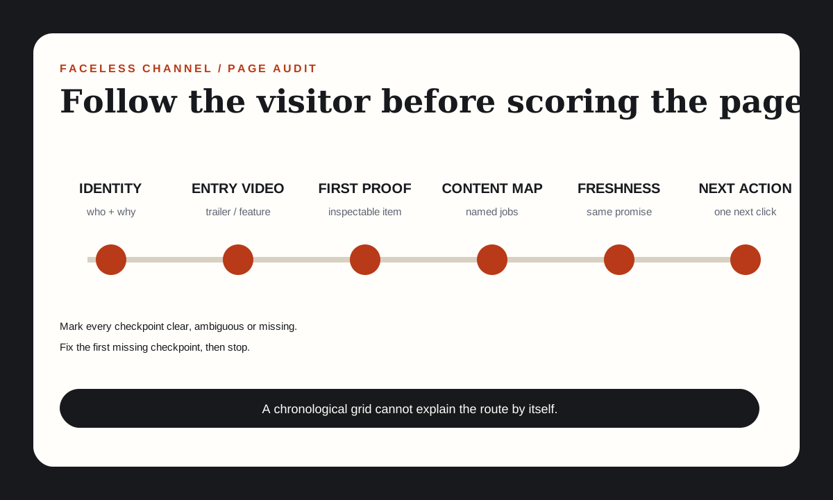
Run a six-checkpoint channel-page audit
- Identity: Does the channel name and description name the audience and recurring viewer job?
- Entry video: Is there a trailer or featured video that demonstrates the promise rather than explaining the channel in abstract terms?
- First proof: Can a visitor see one representative source, test, example or framework without guessing which thumbnail to open?
- Content map: Are there named sections for the jobs the channel actually repeats?
- Freshness: Does the newest video still belong to the same promise and visual system?
- Next action: After one video, does the page make the next useful step obvious?
Mark each checkpoint as clear, ambiguous or missing. Stop after finding the first missing checkpoint. Fixing the earliest break makes every item after it easier to judge.
Design the first screen around one current proof
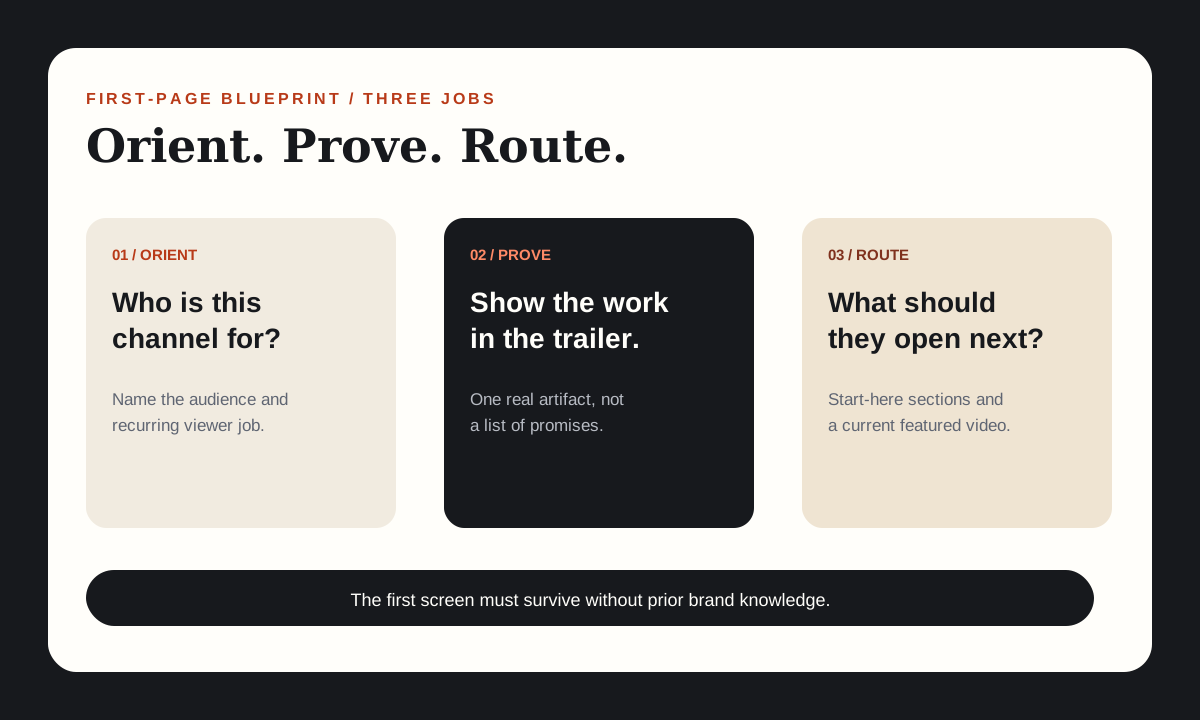
The first screen needs three pieces of information: who the channel is for, what recurring job it performs and which recent artifact proves that claim. The banner can add personality or a publishing schedule, but it should not carry the entire explanation in unreadably small type.
For a faceless channel, the proof video matters more than a generic “welcome” clip. The trailer can show the recurring evidence type, the visual grammar and the kind of decision the viewer will be better equipped to make. It does not need to summarise every topic.
YouTube describes the channel trailer as a preview for viewers who have not subscribed and the featured video as a separate slot for returning subscribers. That suggests two different jobs. The trailer introduces the channel’s promise; the featured video can send returning viewers to the most useful current installment.
| Visitor | Question | Page job |
|---|---|---|
| First-time visitor | Is this channel for me? | Audience, promise and proof example |
| Curious browser | What kind of help will I get? | Named sections and one representative artifact |
| Returning subscriber | What should I watch next? | Current featured episode or series |
Use sections to represent jobs, not upload dates
Chronological grids answer “what is new?” They do not answer “where should I start?” Use sections around repeatable jobs the channel actually owns.
A useful section label is a mini-promise: “Build the first 50 episodes,” “Audit a format before scaling,” or “Check rights and release readiness.” Avoid vague shelves such as “More videos” or “Best content.” The viewer should know what changes after watching the section.
Keep the first section small. Three to five strong entry points are easier to choose from than twenty equal cards. Move the broader archive below that. If the channel has only a few episodes, a single “Start here” shelf may be better than several thin sections.
The section map should also expose gaps honestly. If the channel promises planning, compliance and visual identity but has no episode for one of those jobs, do not create a section that contains only repackaged versions of the same idea. Add the missing proof before adding the label.
Worked example: audit the current FacelessLanes page
Chrome was used on 2 November 2026 to inspect the live FacelessLanes channel page. The page displayed its name, handle, short description, website link and a selected Videos tab showing the newest uploads. No Home tab, channel trailer or featured section was visible in that state.
Checkpoint one passed: the description names sustainable faceless YouTube channels and the kinds of work the channel publishes. The content map checkpoint did not pass: a new visitor had to infer the channel’s structure by scanning a chronological list.
The first missing checkpoint was therefore the entry surface, not the video quality. The single next repair is to create a Home layout with a trailer for first-time visitors and a “Start here” section containing representative proof. The same change should include a featured video for returning viewers.
This is a concrete audit because it records the observed page state and one repair. It does not claim that adding a trailer will increase a metric. It removes a navigational ambiguity that can be judged independently.
Fix one weakness at a time
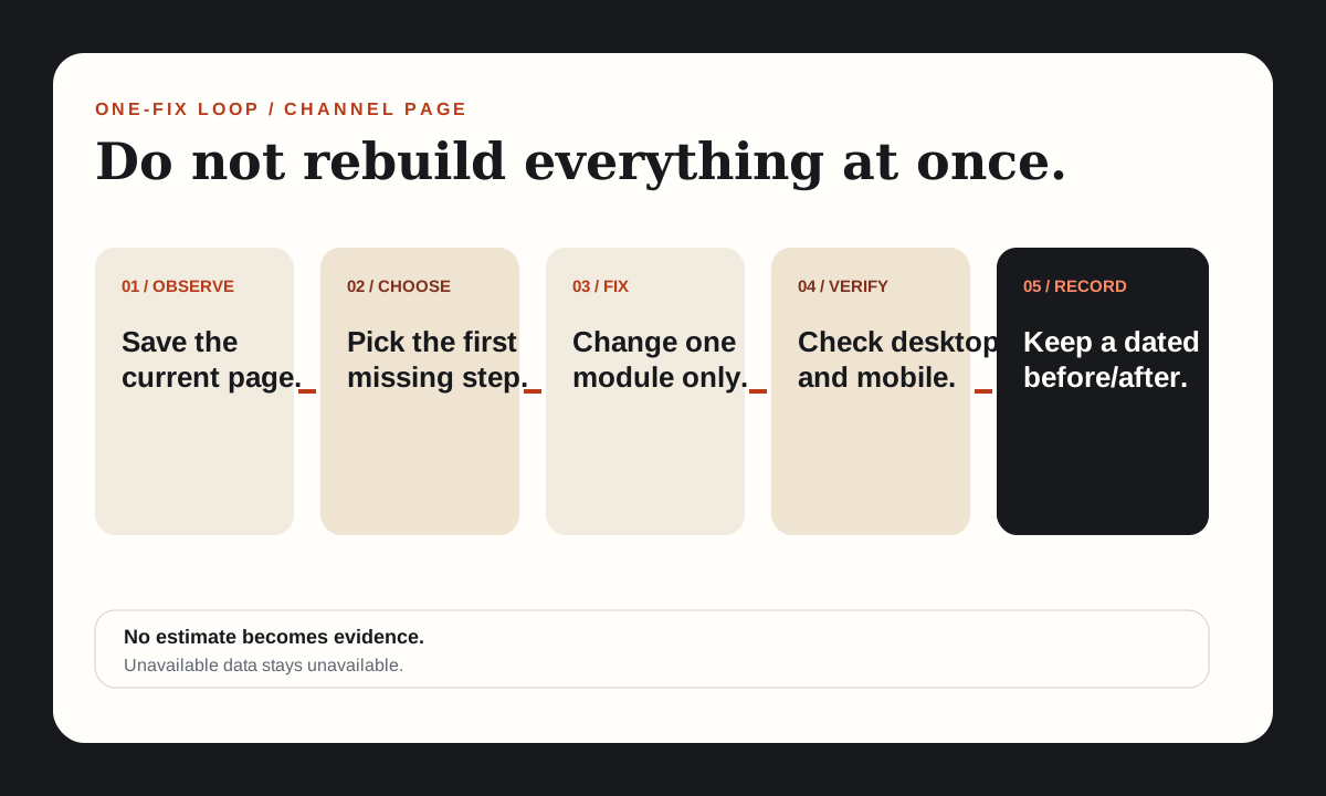
When a channel page is weak, the temptation is to replace the banner, rewrite the description, redesign every thumbnail, create a trailer, add ten sections and change the upload cadence in the same week. That creates a page with no interpretable history.
Use a one-fix loop:
| Step | Record | Done when |
|---|---|---|
| Observe | Screenshot and notes of the current page | The weakness is visible and named |
| Choose | The earliest broken checkpoint | Later issues are left unchanged |
| Fix | One layout or copy change | The page has a new inspectable state |
| Verify | Desktop and mobile views | The intended module is visible without guessing |
| Review | Available data and a dated page record | Unknown values remain labelled unavailable |
For this worked example, the proposed first fix is not a logo. It is the addition of a Home structure that makes the existing promise and evidence easier to find. The channel’s visual identity can remain stable while navigation changes.
Write a trailer that shows the channel’s work
A channel trailer does not need a biography. For a faceless channel, the strongest trailer often has the same structure as a useful episode: a clear question, a representative evidence object, the recurring format and a precise next step.
Use this 25–45 second outline:
- Name the viewer and recurring problem.
- Show one real artifact rather than describing the channel in adjectives.
- Display two or three content families with concrete outcomes.
- Point to the best first episode and invite subscription for the next useful question.
Do not claim outcomes you have not measured. “Here is the decision framework” is supportable when the framework is visible. “This is the fastest way to grow” is an unsupported promise unless the channel owns evidence for it.
The trailer should match the channel description and the first section. If the trailer promises format audits but the top row contains unrelated uploads, the page creates a contradiction before the viewer clicks anything.
Review the page without inventing a score
After publishing the layout change, keep a dated screenshot and the exact set of videos shown. Compare the page against the same checkpoints rather than inventing a “channel score.” If analytics are relevant, use available platform values and mark unavailable values plainly.
A good next review has three parts. First, can a person who did not build the channel name the promise from the first screen? Second, can they identify the first proof module and the next episode? Third, did any label, thumbnail or trailer claim become inaccurate when the newest upload changed?
The page audit is not a demand to redesign forever. Its goal is to make the current promise easy to enter, prove and continue. Once that is true, the next editorial improvement belongs in the episodes, not in more layout decoration.
Sources and claim notes
These links support the platform and policy statements named in this guide. The frameworks and production checks are original editorial analysis.
- Customize your YouTube channel layoutOfficial guidance on the Home tab, channel trailer, featured video and featured sections.
- Channel banner & profile picture tipsOfficial guidance on consistent channel visuals and what profile and banner images should communicate.
- Thumbnail & title tipsOfficial guidance that titles should accurately represent the video.
- Thoughts on the Channel Page?Live Reddit request for channel-page feedback surfaced in a US-English Google result on 2 November 2026; used as a question source, not a factual authority.