A YouTube niche becomes recognizable when its visual system carries the viewer from the promise to the proof. The kit should preserve that job across episodes without turning every upload into the same template.
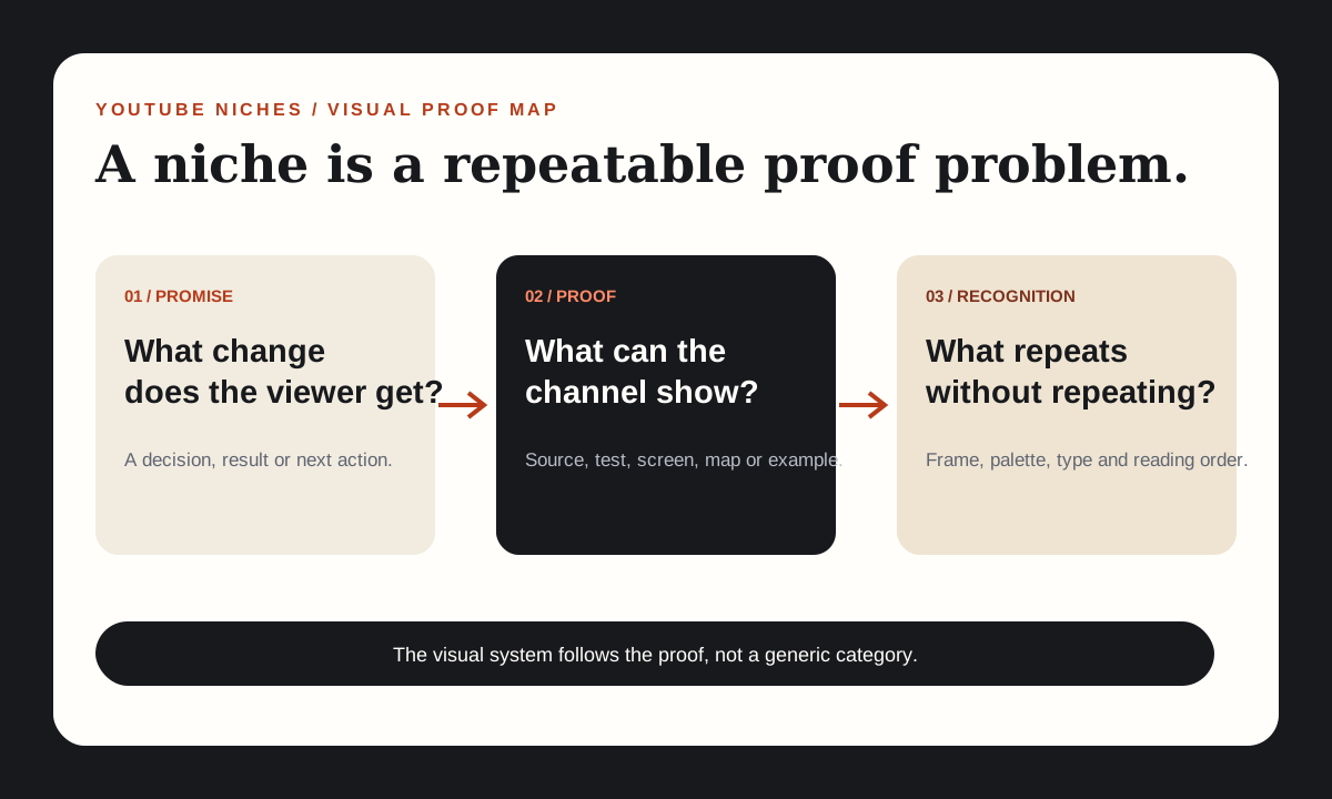
“Finance,” “history,” “AI,” and “fitness” are categories, not visual formats. A viewer cannot recognize a channel from a category label alone. They learn the channel through repeated relationships between a promise, a type of evidence and a visual treatment.
A YouTube niche is a repeatable proof problem
The useful youtube niches question is not only “what topic has demand?” It is also “what can this channel repeatedly show that makes the topic understandable or trustworthy?” That second question turns a niche into a production system.
A spreadsheet tutorial shows inputs and outputs. A policy explainer shows source comparisons. A repair channel shows the failed state and the corrected state. Each provides a visual object the audience can inspect. The object changes by episode, but its role stays stable.
Before choosing colors or fonts, write one sentence with four parts:
For [viewer], this channel answers [recurring question] by showing [proof type] and leaving them with [artifact].
Example: “For beginner sellers, this channel answers one shipping-cost decision by comparing published rate rules and leaving them with a completed calculation.” That sentence suggests the evidence frame, the reading order and the artifact. A logo cannot rescue a niche with no repeatable proof.
Separate channel identity from episode identity
Channel identity answers “do I know where I am?” Episode identity answers “why is this installment different?” A continuity kit must serve both.
| Layer | Stays stable | Changes with evidence |
|---|---|---|
| Channel | Name, mark, palette, type roles, voice | Seasonal or campaign variants |
| Series | Question card, evidence frame, artifact style | Series label and recurring proof type |
| Episode | Functional position of title and source | Specific question, source, example and artifact |
YouTube’s channel-branding guidance says a profile picture and banner should communicate the channel’s identity and recommends a consistent look, feel and voice. That is the channel layer. It does not mean every video should use the same decorative frames.
The stronger rule is structural consistency: the viewer knows where to look for the question, source and conclusion, while the actual evidence determines the episode’s visual center. Consistency becomes orientation rather than repetition.
Build an eight-part continuity kit
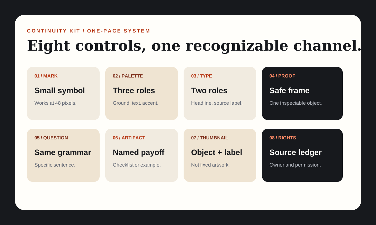
The kit should fit on one page and be usable without opening a mood board. Start with eight parts:
Mark
One simple symbol that survives a 48-pixel profile image and a busy thumbnail.
Palette
One background, one primary text colour and one accent tied to evidence.
Type roles
One face for headlines and one for source labels or interface text.
Proof frame
A recurring safe area for a document, test, screen or comparison.
Question card
The same visual grammar for naming the episode’s viewer decision.
Artifact style
A consistent look for the checklist, scorecard or worked example.
Thumbnail grammar
Fixed relationships between object, label and promise, not fixed artwork.
Rights field
A record of the source and permission for every recurring asset.
This is enough structure to produce daily work, but not so much that the format cannot evolve. Add an official logo after the channel passes a three-episode recognition test; a new creator should spend more time on proof readability than ornament.
Map the niche to a proof surface
Different niches produce different visual proof. Do not force every subject into the same stock montage.
| Niche shape | Better proof surface | Recurring visual element |
|---|---|---|
| Software or workflow | Screen capture with a before-and-after state | Input bar, action label, verified output |
| Policy or research | Source comparison and annotated excerpt | Claim row connected to a source marker |
| Data and finance | Worked calculation or changed decision table | Assumption card and result band |
| Physical process | Steps, tools and the corrected object | Top-down work surface and numbered stages |
| History or places | Map, timeline or record comparison | Date rail and evidence callout |
The proof surface decides the channel’s natural composition. A data channel that uses a presenter’s desk as its only visual home is hiding its strongest asset. A repair channel that replaces the workbench with abstract shapes makes the actual proof harder to inspect.
Use a proof inventory before finalising the palette. List ten episodes the channel can produce and write the object each one needs. If the same decorative background is the only common element, the visual idea is too thin.
Design a thumbnail grammar instead of a thumbnail template
A thumbnail grammar defines how information relates. A template merely repeats the same picture. The grammar should answer four questions:
- Where does the viewer’s problem appear?
- Which physical evidence object gets the largest area?
- How does the channel mark remain identifiable without crowding the package?
- What changes when the episode’s evidence changes?
A finance channel might reserve the left third for a short problem label and the center for one worked number. A repair channel might reserve the before-state on the left and the corrected object on the right. Neither needs a fake facial expression or a borrowed stock scene.
YouTube’s thumbnail guidance recommends that the title accurately represent the video; a mismatch can cause viewers to stop watching. The same standard applies to the thumbnail. Visual recognition is useful only when it points to the actual episode.
Build three thumbnail candidates from different episodes at the same time. Put them beside each other at small size. If they look like unrelated products, the system is too loose. If only the text changes, the system is too tight.
Carry the same identity into the channel surface
YouTube’s branding controls let a creator update profile images, channel banners and video watermarks. Use those surfaces as extensions of the editorial system, not as unrelated advertisements.
The profile image should work as a compact channel signature. The banner can explain what the channel does and can include useful information such as a regular upload schedule. YouTube’s profile and banner guidance recommends a consistent look, feel and voice, and suggests a banner image of at least 2560 × 1440 pixels for display across devices.
Keep the same primary accent and type relationship across the website, channel banner and video graphics. When a viewer moves from a search result to the channel page and then into an episode, recognition should be continuous. The page does not need identical artwork; it needs the same editorial cues.
Before uploading, inspect the banner crop at desktop and mobile sizes. A chart that is readable at full width can disappear into a narrow banner. Draw a safe center area first, then place the durable message inside it.
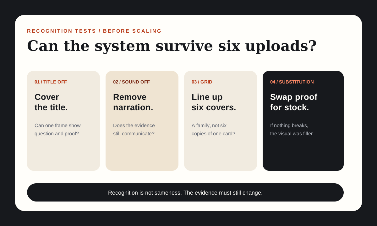
Run four recognition tests before scaling the kit
- Title-off test: Cover the video title. Can someone identify the question and evidence type from one frame?
- Sound-off test: Remove narration. Does the visual sequence still communicate the problem and the artifact?
- Grid test: Place six episode thumbnails together. Is there a recognizable family without every card using the same layout?
- Substitution test: Replace the episode’s proof object with a generic stock image. Does the design lose meaning? It should.
Failures map to specific fixes. If the title-off test fails, create a stronger question card. If the sound-off test fails, make the evidence object larger and annotate the decisive part. If the grid test fails, standardise the viewer’s reading order. If the substitution test passes, the visuals are decorative and need a real evidence role.
Worked example: a first-party visual audit
FacelessLanes uses a cream reading surface, dark ink, a rust accent, restrained serif headlines and diagram-led evidence cards. The recurring identity is not a mascot or an animated logo. It is the relationship between a short editorial claim and an inspectable framework.
Across recent episodes, the article diagrams, video frames and channel branding use the same visual vocabulary. The specific evidence changes: one episode shows a question map, another a workflow comparison, and another a proof-selection ladder. The stable frame helps a returning viewer orient quickly; the changing object gives the episode its own reason to exist.
The kit also exposes a weakness. Some diagrams rely on similar rectangular cards, which can make evidence types feel interchangeable. A next test would assign a distinct shape language to source excerpts, comparisons and worked examples, then check whether viewers can distinguish them without reading the labels.
This is the kind of audit a channel can perform without claiming a performance effect. The output is a visual hypothesis, a changed artifact and a new recognition test. No traffic or ranking value is required to decide whether the system is internally coherent.
Operate the kit as a production checklist
The kit should have owners, defaults and release gates. A compact episode record can contain the following:
| Record | Required value | Release check |
|---|---|---|
| Question card | The exact viewer decision | No topic-label substitution |
| Proof object | Source, test, map or worked example | Can be inspected without narration |
| Artifact | Named deliverable | Appears in the opening and body |
| Palette and type | Approved kit values only | No unlicensed fonts or assets |
| Thumbnail grammar | Problem and proof relationship | Accurate at small size |
| Continuity note | What changes from the last episode | Evidence changes, not only decoration |
Automation can place these controls consistently. It can generate crops, resize diagrams and check minimum text sizes. A person should decide whether the evidence is meaningful, whether the artifact is actually delivered and whether the episode is too similar to its neighbours.
This division keeps the visual system efficient without pretending that a template can make the editorial choice. The kit is successful when the next episode is easier to recognise and easier to prove.
Choose the niche that gives the visual system something real to show
Do not choose a niche because it offers a convenient colour palette. Choose it because the promise can repeatedly produce specific evidence and a useful artifact. Then build a visual identity kit that makes those objects easier to find, compare and remember.
The test is concrete: cover the title, remove the sound and line up six episodes. A coherent channel should still reveal a consistent question-to-proof relationship while each episode contributes a different evidence object.
That is what a visual identity does for YouTube niches with very different topics. It gives the audience orientation without forcing every upload into the same decorative package.
Sources and claim notes
These links support the platform and policy statements named in this guide. The frameworks and production checks are original editorial analysis.
- Manage your channel brandingOfficial YouTube controls for channel profile picture, banner and video watermark.
- Channel banner & profile picture tipsOfficial guidance on consistent channel visuals, recognizable identity, banner sizing and matching look and voice.
- Thumbnail & title tipsOfficial guidance that titles should accurately represent the video and that mismatch can affect continued viewing.
- What does be consistent and find your niche mean?Live Reddit question surfaced in a US-English Google result on 1 November 2026; used as a question source, not a factual authority.